In our activity today we will use GMT again to make a plot that uses a color scale. Color scales are useful because they can be used to color a set of data points, allowing use to see more information about the data. The first plot we made just showed X and Y information, with all the symbols shown a circle. We can use a color scale to plot those symbols with different colors according to additional values from the database.
Our example dataset for this activity is a heatflow database for North America. To begin, create a directory called act6 within your groupwork directory. Then you can copy the heatflow database text file to your act6 directory from this location:
/chiapas/mikeb/database/tect/NoAmer.HeatFlow.gmt
Whenever you copy a new database file over to your directory, it is always a good idea to look at it to see what the database looks like. Use one of the various UNIX programs to look at the contents of this text file (i.e., cat, more, emacs, head ...). What does the database look like? The first few lines should look like this
Longitude Latitude Heat Flow
-148.8522 70.3336 54
-148.6522 70.2689 61
The first line is the header line that describes the values in each column and all the remaining lines are data points. As you can see, this database has an X value (lognitude), a Y value (latitude), and a Z value (heat flow). We can display the location values on a map, but we will need to use a color scale to show the heat flow values on that map. Fortunately, a heat flow color scale that can be used by GMT is also available in the directory where the heat flow databse came from. Copy this file to your directory also:
/chiapas/mikeb/database/tect/heatflow.cpt
We can use psxy to plot our heat flow values, but in this case we will need to add two new options: -C to specify the color scale and -H to skip header lines. The format for these options is pretty simple:
-C(color scale filename)
-H(number of header lines to skip)
The complete options we should specify for our example are -Cheatflow.cpt and -H1. Next we should combine them with the other options we need for this example: -J, -R, -B, and -S. For this example, we would like a 6 inch wide Mercator map, locations that cover central North America (-125 to -65 longitude and 23 to 51 latitude), tick marks every 20 degrees and symbols plotted with small (0.1 inch) circles. To specify all of these options, our command line entry should look like this:
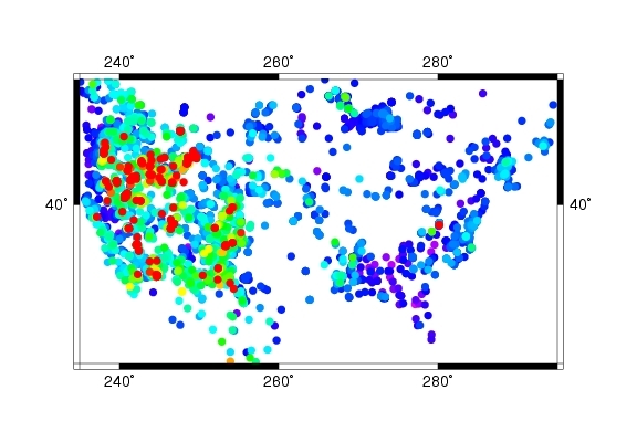
% psxy NoAmer.HeatFlow.gmt -JM6 -R-125/-65/23/51 -H1 -Cheatflow.cpt -B20 -Sc0.1 >! heatflow.ps
Use gv to view the postscript output and see what your plot looks like. It should look like this . You can see all of the data points, but it is a little difficult to see where the data points really are on a map. We can help this problem by also shading in the land areas on the map to reveal the North American continent.
The pscoast command can be used to shade land and water areas on a map. The format for this command is similar to psxy
pscoast options > psfile
We will need to specify -J and -R options like we do for psxy, but we also need to specify options that describe how to plot the land areas. There are two key options we need:
-D(resolution of coast line: h=high, i=intermediate, l=low)
-G(shading information for the land areas: gray scale numbers from 0=black to 255=white)
Here are the options we should use for this example:
-Dl -G200
So for our second version of this map (heatflow2.ps), we need to shade the land areas first, because we want our data points to be plotted on top of the shaded land area. If we did it the other way around, shading land areas would cover up our data points.
Since we have two commands plotting to the same plot we will need to be careful about using -K (more commands coming) and -O (overlay on top of output), and we should use >! for the first command and >> for the second command.
The commands we need for the second map should look like this:
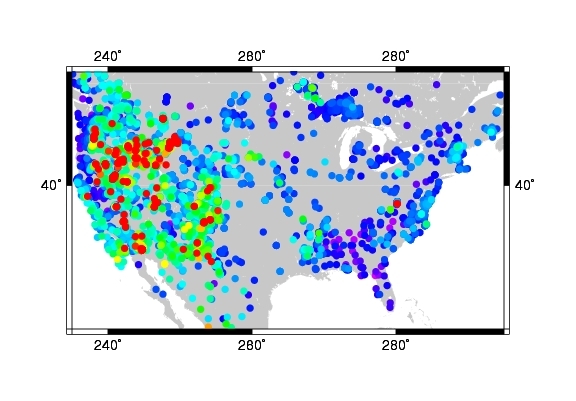
% pscoast -JM6 -R-125/-65/23/51 -Dl -G200 -B20 -K >! heatflow2.ps
% psxy NoAmer.HeatFlow.gmt -JM6 -R-125/-65/23/51 -H1 -Cheatflow.cpt -B20 -Sc0.1 -O >> heatflow2.ps
Use gv to view the postscript output and see what your plot looks like. It should look like this . Now you can see where the data points are on the map, but we still haven't specified what the colors mean. We can help this problem by also plotting a scale bar to show what the different colors represent.
The psscale command can be used to plot the color scale bar. The format for this command is also similar to psxy
psscale options > psfile
This command does not need options like -J and -R like we do for psxy, but there are three key options we do need:
-D(x-location/y-location/height/width)
-B(how many units between tick marks)
-C(color scale filename)
Here are the options we should use for this example:
-D5.2/1/1.2/.2 -B50 -Cheatflow.cpt
So for our third version of this map (heatflow3.ps), we have three things we want to do:
1) Shade the land areas
2) Plot the heat flow data points using a color scale
3) Plot the scale bar
This means we will need our pscoast command first, our psxy command second, and our psscale command last.
We will need to be particularly careful about using our -K and -O options this time and make sure you use >! for the first command and >> for all subsequent commands.
The commands for the third map should look like this:
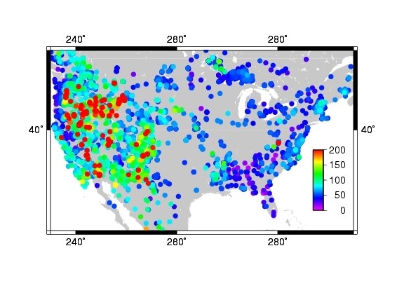
% pscoast -JM6 -R-125/-65/23/51 -Dl -G200 -B20 -K >! heatflow3.ps
% psxy NoAmer.HeatFlow.gmt -JM6 -R-125/-65/23/51 -H1 -Cheatflow.cpt -B20 -Sc0.1 -K -O >> heatflow3.ps
% psscale -D5.2/1/1.2/.2 -B50 -Cheatflow.cpt -O >> heatflow3.ps
Use gv to view the postscript output and see what your plot looks like. It should look like this .
The third version of the heat flow map should finally give you enough information to describe the pattern in the data and begin to interpret it. What is the overall pattern of heat flow values in North America? In other words, where are the values high and where are they low? What do you think is responsible for the high values and what is responsible for the low values? Store your answers to these questions in a file called heatflow.txt.
-C(color scale filename) |
psxy options |
-H(number of header lines to skip) |
psxy options |
pscoast options > psfile |
GMT command to plot coast lines |
-D(resolution of coast line) |
pscoast options |
-G(shading for the land areas) |
pscoast options |
psscale options > psfile |
GMT command to plot a scale bar |
-D(x-location/y-location/height/width) |
psscale options |
-B(how many units between tick marks) |
psscale options | -C(color scale filename) |
psscale options |
![]()
![]()
![]()
brudzimr@muohio.edu, © 12th September 2006