One of the best reasons to provide this tutorial on UNIX/LINUX for you, is to provide you will the tools necessary to take advantage of an excellent graphics package: GMT (The Generic Mapping Tools). GMT is a set of command line programs that can be used to construct a wide variety of plots and maps, many of which are the exact figures you see in published scientific papers. This tutorial will help you to get accustomed to how these commands are used together with what you have learned already about scripting and awk.
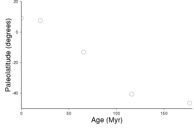
For our first experience with GMT, we will make the simplest kind of plot: an X-Y plot. This kind of plot will allow us to view data with X and Y values to look for trends. Since we often have large text database files to deal with, plotting values stored within the database is often the best way to get an overview of the information contained in the data. To keep matters simple to begin with, we will work with the same small database of paleomagnetic measurements. In the last awk tutorial, we generated a file (age-paleolat.txt) that has age and paleolatitude information. To begin, move into your act4 directory so that we can use the age-paleolat.txt file.
The command we will use to generate our first plot is psxy. The psxy command is one of the many GMT command line programs, and it is designed to plot X-Y data. The typical command line syntax for psxy is
psxy filename(s) options > psfile
where filename(s) is one or more files that have X and Y information in the first two columns and psfile is the postscript file we are directing the output to. For this example, we will be using age-paleolat.txt as the input filename and paleolat.ps at the psfile. The psxy command has many options which can allow you to create very detailed plots, but we will begin with the most basic options necessary to make a plot.
-J(plot-type)(X-axis-size)/(Y-axis-size)
This option specifies which kind of plot we are making including what shape and size it will be. There are many possible plot types, with a variety of map projections being available, but for our simple first plot we just want a linear plot which is type X. For the plot size, we can specify the X and Y axes sizes in inches. To make sure our plot is big but will still fit on a piece of paper, the full option specification we will use for this plot is -JX8/5
-R(Xstart)/(Xend)/(Ystart)/(Yend)
This option specifies what range of values we will be plotting. The four parameters indicate the beginning and ending values for the X axis and the beginning and ending values for the Y axis. For our paleolatitude measurements, the age ranges from about 0 to 180 and the latitude ranges from about -50 to 20. So for this example we can specify the option as -R0/180/-50/20
-B(X-axis-border)/(Y-axis-border)(which-borders-to-plot)
This option specifies what kind of border we want around our plot. The border information for X and Y is usually given in the format of tick:"Label", where tick is how many units between tick marks and Label is text displayed next to the axis. The which-borders-to-plot information is given as direction letters that correspond to the top (N), bottom (S), right (E), and left (W) borders of the plot. You only include the letters of the sides you want plotted. In this case we would like an X-axis labeled Age (Myr) on the bottom of our plot showing a tick every 50 units, and we would like a Y-axis labeled Paleolatitude (degrees) on the left hand side of our plot with a tick every 20 units. We can specify these borders with -B50:"Age (Myr)":/20:"Paleolatitude (degrees)":SW
-S(symbol-type)(symbol-size)
This option specifies what kind of symbol we want the data points to be shown as. For this simple plot, we can choose c for a circle symbol to be plotted. The symbol size is also in inches, so a value like 0.2 is appropriate for this size plot. To specify this type of symbol our option will be -Sc0.2
Now we can put this all together on the command line
% psxy age-paleolat.txt -JX8/5 -R0/180/-50/20 -B50:"Age (Myr)":/20:"Paleolatitude (degrees)":SW -Sc0.2 > paleolat.ps
Once you have made the plot, you will probably want to view it to see what it looks like. We can use the gv program to view our postscript file output
% gv paleolat.ps &
Recall that the & will allow us to continue typing commands on the command line without having to close the gv program. This is convenient if you will make several versions of your plot, which is very common when working on a new plot. In any case, gv should cause a window to pop up on your desktop showing your plot. You can check to see if your plot is correct by comparing with this plot.
Now create a new plot called paleolat2.ps by adjusting the psxy command options to change:
- the size of the plot to have the X-axis 6 inches long
- the range of data to have the X-axis go from -10 to 200
- the border of the Y-axis to be labeled "Paleolatitude of India"
- the symbol type to a 0.3 inch cross (use "x" instead of "c")
While it has taken us several days to learn how to use some basic UNIX tools, we are now finally at the point where you can start doing some data analysis.
For this exercise you can use either one of the two plots you have made (paleolat.ps or paleolat2.ps) since they both show the same data. How would you describe the trend in this paleolatitude vs. age data? Is it linear? Why or why not? What processes are responsible for the change in paleolatitude of India over the past 200 million years? Please open a new file called analysis.txt using emacs and type in your answers to these questions.
psxy filename(s) options > psfile |
make an postscript X-Y plot from filename |
-J(plot-type)(X-axis-size)/(Y-axis-size) |
psxy option for plot size and shape |
-R(Xstart)/(Xend)/(Ystart)/(Yend) |
psxy option for range of values |
-B(X-axis-border)/(Y-axis-border)(which-borders) |
psxy option for axis borders |
-S(symbol-type)(symbol-size) |
psxy option for symbol type |
![]()
![]()
![]()
brudzimr@muohio.edu, 28th August 2006